


, with questions about Russia, Israel, esports, doping, college chaos and, of course, track & field")


 in 2027")


(★ Friends: Your 65 generous donations have paid our semi-annual server and support costs, and started to help with December’s bill. If you would like to help, please donate here. Your interest and support are the reasons this site continues. ★)
“I think the days of ‘command and control’ are over, and the days of engagement and co-creation are upon us and that’s going to require us – frankly – to be a little, and maybe less, us, and move the Olympic Movement a little out of its comfort zone.”
That’s how Casey Wasserman, chair of the LA28 Organizing Committee, described the innovative – even wild – emblem program for the Los Angeles 2028 Games. During a half-hour, pre-launch videoconference with reporters, Wasserman explained the program and the process. Highlights:
● “There’s not one way to represent Los Angeles and there is strength in our diverse cultures. Every neighborhood, every block, every person has their own unique story, and because of this, Los Angeles defies a singular identity. We’re all Angelenos, shaping the future, together.”
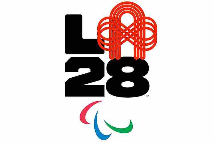
● “The LA28 Olympic and Paralympic emblem is strong and bold and allows for endless storytelling opportunities. It reflects the spirit of Los Angeles is ever-evolving and looking towards the future. The ‘L,’ the ‘2′ and the ‘8′ create a strong foundation and anchor an ever-changing and dynamic ‘A,’ which represent the infinite stories of Los Angeles and the Games.
“Animated and dynamic, the emblem is built for the digital age, thriving on broadcast, digital and social platforms. And most importantly, with an unprecedented eight-year runway to the Games, the LA28 emblem is designed to stay relevant and keep people engaged for our entire journey.
“And because there is not one way to represent L.A., we want to make sure – right off the bat – that the LA28 emblem captures the infinite storytelling possibilities through a collection of voices.”
● “This is not about the old days of command and control of creating a singular logo and push it to the world.”
There are 26 initial versions of the emblem – all of which are animated – designed (or collaborated on) by a collection of athletes, activists and Angelenos, including eight Olympic medalists: Gabby Douglas (gymnastics), Allyson Felix (track & field), Michael Johnson (track & field), Chloe Kim (snowboard), Simone Manuel (swimming), Alex Morgan (soccer), Ibtihaj Muhammad (fencing) and Adam Rippon (figure skating). Emblems were also contributed by five Para athletes Ezra Frech, Jamal Hill, and Paralympians Lex Gillette, Oz Sanchez and Scout Bassett; and junior boxer Chantel Navarro.
Emblems from artists and performers include actress Reese Witherspoon, singer Billie Eilish, multimedia artists Alex Israel and Steven Harrington, graffiti artist Chaz Bororquez, storyteller Lilly Singh and tattoo artist Dr. Woo. The remaining five were created by activists, community leaders and entrepreneurs such as Jorge “El Joy” Alvarez, Bobby Hundreds, Aidan Kosaka, Lauren “Lolo” Spencer and Rachel Surnekh.
Six of the emblems combined the LA28 mark with the Paralympic logo and the other 20 are paired with the Olympic rings. You can sample the 26 “As” (and see the animations) here or walk through them (with animations) here.
Wasserman was asked about the process of creating the concept:
“So, this process started maybe 18 months ago and we always set the bar high for ourselves in terms of really representing L.A. and we struggled for a while with this tension between traditional emblems in all the sports, which are static, and L.A., which is a dynamic and changing city, and a journey that is eight years long.
“And the design team came up with this incredible combination of the two, this really strong foundation that the ‘L,’ the ‘2′ and the ‘8′ provide and this opportunity for dynamism and individuality in the ‘A.’
“And that process was complete towards the end of last year and the beginning of this year. And so recent events didn’t shape the approach, but we love the opportunity to share incredible stories from the diverse nature of Los Angeles through this platform and are excited to have the ‘L’, ‘2′ and the ‘8′ be a vessel – if you will – for sharing the stories of the community of Los Angeles.”
He acknowledged that this was a different kind of visual identity program, but still grounded in the intellectual property world of today:
“So, all the ‘As’ that you’ve seen and that will go out are all protected and registered through copyright. We’ve done that in close coordination with the IOC’s copyright team and ours. I think in the ones we intend to use commercially, we will clearly protect from a copyright perspective. …
“[I]if we’re going to commercially use an ‘A,’ clearly it’s something we need to be thoughtful and careful about, but that doesn’t mean we need to protect and control all “As,’ that are shared out in the world.”
The typography for the “L” and the “28″ characters is a custom design with Los Angeles designer Jeremy Mickel. The LA28 announcement credits Work Collective, Stink Studios, Media Monks, Cashmere Agency, Giant Spoon, Clarus and the Nike Design Team as creative collaborators.
(Wasserman wore a burgundy top during the videoconference with a highly-visible Nike logo, further teasing a future sponsorship announcement with the sportswear giant.)
First impressions?
Wasserman has promised that LA28 would re-imagine what the Games can be, and the organizing committee delivered with this “emblem” concept. It is decidedly fresh and different, clearly digital-friendly and embraces the rush for user-created content that is everywhere these days.
Those are the good things. The launch makes a series of statements:
● The emblems as illustrated by the first 26 styles stamp 2028 as a Los Angeles Games, not a Games held in the U.S. Not one of the emblems shown has a red, white and blue theme, or uses the Stars and Stripes. There is no requirement to do this, of course, but the message is strikingly clear. Paris for 2024 is using a golden flame design which incorporates the national theme of “Marianne, the personification of the French Republic.”
No doubt there will be user-created versions of the LA28 emblem with national-themed “As,” but these are not now part of the first group of symbols.
(You also have to wonder what the reception will be in Oakland, where the American League As play and have a famed “A’ logo stretching back decades.)
● The push for co-creation and co-promotion with users is timely and cutting-edge, just as has been hoped for from LA28. Skipping a static image for one which can be individualized mirrors today’s availability of personal brands on shared media platforms. But, sad to say, this freedom will also be abused and the organizing committee will now have to police its usage, locally, nationally and internationally.
That will not be easy, both as to content and as to sharing on buttons, flags, T-shirts and other items which might end up being sold without any license or permission.
● The infinite-option emblem program makes an important statement about Los Angeles in 2020 and the near future. The collective decision of the designers to eschew a single image around which people could come together for a template from which everyone can create their own says L.A. is not one, but many. How will that square with the Olympic concept of bringing the world together in one place at one time for peaceful competition?
The design can be interpreted as showing Los Angeles as 75% community – in the “L” and “28.” and 25% individual, but a close inspection of the design shows a slightly different appearance in each character. Southern California has been described as a giant mosaic: this logo accurately reflects that sentiment.
It was disappointing that the first 26 emblems shown did not include any from the icons of the Games of the XXIIIrd Olympiad in 1984. Perhaps a couple more – to get to 28 – could be added from any of the great stars of the Games, such as Edwin Moses, Mary Lou Retton, Carl Lewis, Greg Louganis, Joan Benoit Samuelson, Michael Jordan or others.
There is a faint echo of the 1984 Games design program in the 2020 brand concept, not from the Games itself, but from the unique 1983 poster series which featured 15 highly individual visions of the Games from storied artists including John Baldessari, April Greeiman and Jayme Odgers, David Hockney, Roy Lichtenstein, Robert Rauschenberg and others. The 2020 brand idea is very much in line with their wide range of visual expressions of the Games. (You can see these posters on pp. 572-573 of the PDF scan of the Official Report of the 1984 Games.)
Perhaps the most important takeaway from the LA28 brand launch is that the organizing committee didn’t take the easy, convenient or conventional route in creating its visual identity. It imagined a new, flexible and endlessly inventive platform instead of a simple statement.
That’s a reflection of the way technology connects us today, especially in major American cities. It’s a positive sign for the 2028 Games and for the future of the Olympic Movement that the organizing committee takes its role as both custodian and innovator very, very seriously.

 in Lausanne; Yates new Tour leader")